Content discovery in the Content Design Academy
This guest blog post is written by students of the Content Design Academy.
We are running our first 12-week Content Design Academy and we've got a stellar group of people working on a project for Action Duchenne. The charity helps children with muscular dystrophy and their families.
Here, the academy students share their learnings and experiences on working with stakeholders and mapping a user journey.
Users first, content second
by Matt Billingsley and Amy Grinstead
Content design forces you to take a big step back before you write. It involves considering your users’ needs, how they see the world, and analysing how well your content matches.
Defining user needs first stops you from jumping to assumptions about what your content should say and how it looks. This saves time and keeps things factual.
Understanding your users’ wider context, such as their common journeys, tasks, and mindsets helps you to identify formats that best meet their needs.
Often, the ‘solution’ is simple, but it’s not until you do this groundwork that you have enough evidence and confidence that the content you’re designing will meet their needs.
Keep up the momentum
Maintaining momentum is important. You can’t afford to dwell on a particular step of content design for too long.
You need to regularly demonstrate your progress to stakeholders and get feedback from peers. The academy has given us tools to keep up the pace, as well as pointers on how long each stage should take and the people who need to be involved.
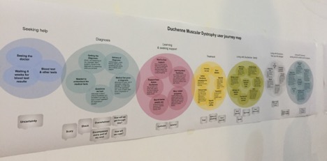
In 6 weeks, we’ve gone from raw data and quotes in the discovery phase, to a detailed journey map about how parents and children live with Duchenne Muscular Dystrophy. This has led to an extensive spreadsheet of user needs which has acted as a checklist to inform our early sketches of how we are going to prioritise and structure content on pages.
It’s leadership
Working in content design requires leadership skills. At a basic level, you need to explain its value, methodology, and be ready to defend the discipline.
Practically speaking, you can boost your credibility by championing users’ needs, identifying gaps or unmet needs in content, and have an opinion on what formats can best meet different user scenarios.
The CDL Academy has emphasised that content design is a collaborative process. It requires working closely with end users, experts and leaders of organisations to make sure that your content design recommendations can be implemented and are sustainable in the long run.
Hearing the user’s story
by Jackie Mehlmann-Wicks and Kate Flagg
In our first session, Lynnette, the Community Fundraising Support Officer for Action Duchenne, was invited to speak about the charity for 30 minutes. She wasn’t given a specific brief, which meant she could talk freely about what she thought we needed to know.
Lynette spoke openly about Duchenne Muscular Dystrophy and her experience as a parent of a child with Duchenne. She described the emotional journey that families go on, and how the charity helps.
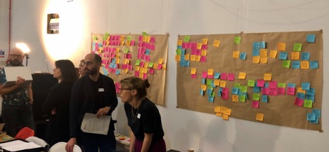
While we listened, we wrote quotes and important information on post-its for our discovery wall and asked questions after Lynette had finished speaking.
We started building a picture
Lynette helped us to build up a picture of the charity from multiple perspectives. She represented both the end-user and the charity, so we gained insights into user needs and how the charity aims to meet them. It became clear that the website needs to better reflect their work.
Speaking with Lynette reminded us that we design content for real people, who are varied in their knowledge and in the timing of their needs, despite shared experience.
It allowed us to empathise with the end-user, which gives us the capacity to design a better experience for them – one that uses their language and takes their emotional state into account.
What this meant for us
It was difficult to listen and take notes simultaneously. Next time, we’d record and transcribe the interview, so we could give the speaker our full attention before writing notes.
We’ll continue to speak to end-users and stakeholders at the beginning of the discovery phase. It’s invaluable to listen to people describe their experiences in their own words. Combined with other types of discovery research, patterns soon emerge.
Building a discovery wall
by Jonti Eccles and Jen Veall
After Lynette’s talk, our task now was to turn our collective note-taking into a visual representation of the things the people in those families go through, what their needs are, and the best help Action Duchenne can give to them.
This all sounds like it will take a lot more than post-it notes on a wall (it does), but that’s the starting point.
Working to build a timeline
Getting all of the post-its up onto the wall gave us something we could move around and group into notes around particular moments in a person’s journey. There were groups covering areas like ‘What parents want to know at the time of diagnosis’.
We worked collectively to sort these groups into an overall timeline. It gave us the sense of an overarching user journey that Action Duchenne’s content would represent.
Not all notes are easy to group. You’re necessarily making a few assumptions and a good few won’t stand the test of more rigorous research.

Feeling overwhelmed
The exercise generated a large amount of information – and it is initially easy to feel overwhelmed by this, and the difficulty in imposing any kind of order. We struggled sometimes to know how something that seemed an important issue fitted into the groups of user needs we were creating.
Getting a sense of the bigger picture
However, it is important to remember that this is the first step. It’s a good way to quickly get a sense of the bigger picture, and a way to start familiarising ourselves with the information and drawing out the user needs we need to create our content.
If a key component of good content is using the right tool, then post-its are a pretty good tool for getting to grips with a lot of information and having the flexibility to quite literally move it around as you develop your ideas.
What we took away from this exercise was not to get stressed out by a wall of a hundred ideas – clarity will come the further through the discovery phase you go!
Making a user journey
by Clare Reucroft and Stella Dunn
A user journey allows you to see what your users may experience, whilst addressing their need(s), at any given point in the process.
Creating that journey can help content designers:
- identify the different stages someone goes through
- what they might feel at each stage (and across the journey)
- challenge assumptions you or others may have
How we mapped our journey
First, we needed to understand Action Duchenne’s goals and the people the charity wants to help.
From our first post-it sorting exercise, we had grouped themes like:
- diagnosis – ‘coping with diagnosis process’
- financial support – e.g. ‘how can I afford to adapt my home?’
- education – ‘what support will my child get at school’.
These groups weren’t necessarily in an order that could be called a journey.
Then, with a little help from our course tutor Hinrich, we thought about the main steps of a health-related user journey. Typically, it can look like this:
Trigger → Diagnosis → Treatment → Management
So, for mapping our Duchenne user journey, we grouped our post-its under these main stages:
Pre-diagnosis → Diagnosis → Post-diagnosis → Living with the condition
We then mapped the major themes, user needs and possible emotions at each stage. Eventually, we ended up with something that resembled a user journey.

A couple of tips…
You can drown under post-it notes. So, it’s good to organise them from the moment you start listening to your users. Take one post-it and write a category heading on it. Then put all the relevant post-its under that heading as you go along. Half the job is then already done.
It’s good to be ruthless too. Chuck out the post-its with too much on them. Keeping it simple works best.