Getting sign off from academics
This is a guest blog post written by Georgina Brooke. She has spent the best part of her career working for and with museums across the UK.
Let's start with some context.
I have just launched a series of websites for the University of Oxford, including:
- Oxford Botanic Gardens,
- Ashmolean Museum,
- Museum of Natural History,
- Pitt Rivers Museum,
- Libraries (forthcoming),
- History of Science Museum (forthcoming).
When I say ‘launched’, that hides quite a lot of work! This was no scripted content migration or copy and paste job. This was a full start to finish content design come institutional digital transformation piece.
Which is a fancy way of saying I did these things:
- External user interviews
- Internal stakeholder interviews
- Surveying
- Content auditing
- New IA development
- New Digital Identity (outsourced), including wireframes
- New technical CMS development,
- Agile project management of new platform functionality prioritised against fixed budget and time
- Content design of every page and section of the site
- Evaluation, tracking, user testing including eye tracking
Amongst other things, I also delivered staff training on:
- analytics,
- SEO,
- writing for web and the mobile web,
- digital marketing,
- how to deliver a new digital identity
- style guides,
- social media.
What I really want to talk about is the process of content design within a University Museum setting. The wonderful thing about a Museum, particularly a University Museum, is the diversity of people you meet with.
A project like this is designed to tell the world about the inner workings of the Museum, which means understanding what everyone’s job is and how that translates to something we need to communicate to different sorts of visitors.
A University Museum employs everyone from wedding planners to very esteemed academic professors or art history, archaeology, anthropology or the natural sciences (the list goes on).
One of the trickiest things, not just about this project I expect, but about content design, in general, is working with experts. Experts are occupying a difficult place in public consciousness right now. I, unlike Michael Gove, think that people have not necessarily heard enough of experts.
So much of my job as a content designer is trying to extract meaning, fact and usefulness out of often vapid corporate or promotional statements. When you get down to the meat of a lot of this kind of content, there is very little of substance to tell a visitor.
A visitor doesn’t need to be told a room available for wedding hire is ‘opulent and intriguing’, they can make their own mind up about that from the pictures. They need to be told the capacity, details about the historic nature of the room and its collections and the price.
You have the converse problem with experts. Experts, researchers do have new things to say, ideally (in their world) things that have never been said before. But because of this, they are very cautious that things get said right.
Whereas the problem with marketing teams is often too many adjectives, the problem with academic text is too many qualifiers. Whilst a certain gallery may be ‘opulent, intriguing, raspberry pink’ to the wedding hire team, it is likely to be ‘a representative room, within a style approximating baroque, in the long 17th century, in England’ to a curator.
Neither is yet telling me (as a general visitor) anything very interesting.
My experience of experts is that they are often:
- busy,
- unfamiliar with digital best practice,
- in senior positions.*
*at least, in a University Museum, I expect this differs in the big London museums.
They are the people who are most likely to send you a very long word document, complete with footnotes and track changes. They're also likely to suggest we upload the word document as a web page and have done with all these conversations about what the Museum’s tapestry collections contain.
So, the nub of the problem is: how can you use the brilliant expertise the researchers have? But also, how can you keep it within a framework which is consistent with the tone (and copy length!) of the site as a whole and digital best practice? How can we get the researchers collaborating with us (and to them, we are basically the marketing or admin team) in an intelligent and synergistic way?
On an anecdotal level a lot can be said for engaging them on their level, making this an academic problem they can solve. Bring it back to the user, and make more of your own expertise in things they are not expert (like the visitor needs, reading age, and reading patterns on web [are not reading but scanning]) and by referencing papers (primarily Jakob Nielsen’s Eye Tracking on the Web paper).
On more of a practical, process level I developed something I have called a Content Manual.
Here is an example opening paragraph of the Content Manual for one of the curatorial Departments:
Example: Department content manual v1
Aim of this document
There are three main aims of this document:
- To outline the new navigation proposed for the Museum site and where this Department’s collections landing page should live within it.
- To identify the purpose and intended audience for this page
- To translate both the context of where the page sits, the purpose of the page and intended audience into a consistent and appropriate Museum style in the form of a suggested text. This is by no means definitive, and in this version (v0.1) the purpose is to encourage discussion and a re-examination of how best to present this curatorial Department on the new Museum site.
This isn’t the approach I’d use with the commercial team (they like a lot fewer words and a lot more charts and pictures). But it works well in an academic context.
The first part of the manual presents where the page in question lives in the Information Architecture of site navigation. This gives the reader context on how a user might get to this page from the homepage. But it also explains that a lot of visitors will come direct via Google search based on the keywords of their search enquiry and the site page copy.
In the second part of the manual, it identifies what user needs the page needs to meet. This is a really important step as it gets the expert away from thinking ‘what do we need to tell the visitor’ into thinking about ‘what does the visitor need to hear from us here’. Quite an important shift in perception and a useful way of making this thinking explicit (and also up for discussion).
The final part seeks to answer the prioritised user needs with information blocks that correspond to page modules. If the first thing we need to tell the visitor to the Department landing page is what the remit of that Department is, what is the best way to present that? Probably a couple of sentences of text and a visual grid listing of the subcollections that department contains. And so on.
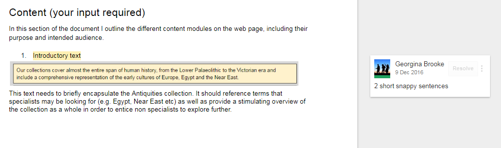
I took screenshots of what the module might look like and what format it needed to be in (images vs text, how much text, what did it need to cover). And so, I had given the experts a structure and coherency to page planning and then they could easily collaborate with me. They could inform the page copy with their much needed knowledge and substance. But it was done in a way that had a structure, tone and user centred methodology that was sympathetic to the site.
I used these numbered modules so that the researcher could input the approximate text length into the document directly. At the same time, they'd be able to see the visual context in which it would be used.
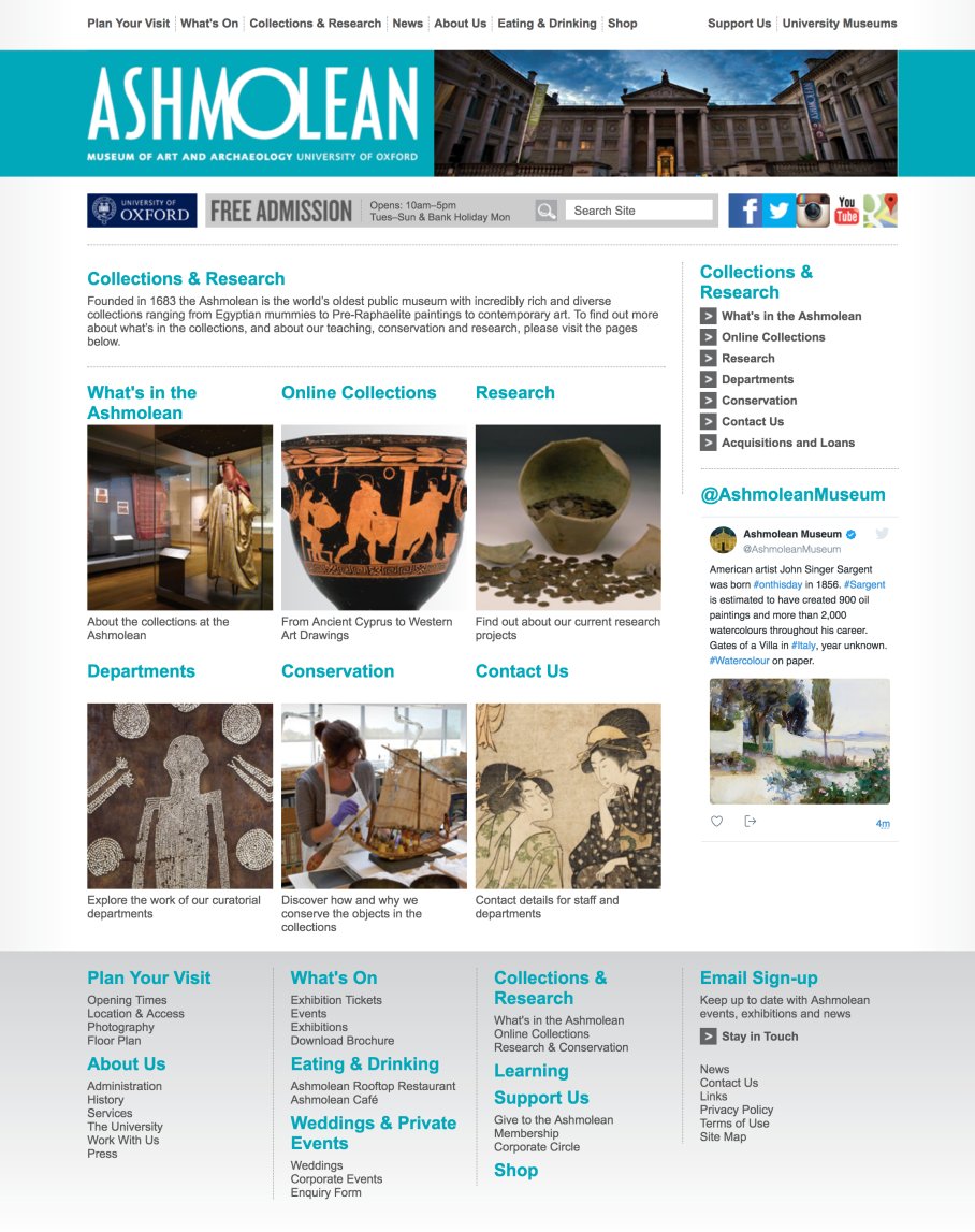
Here's a before screenshot of the antiquities department landing page:
And here's an after screenshot of the antiquities department landing page:
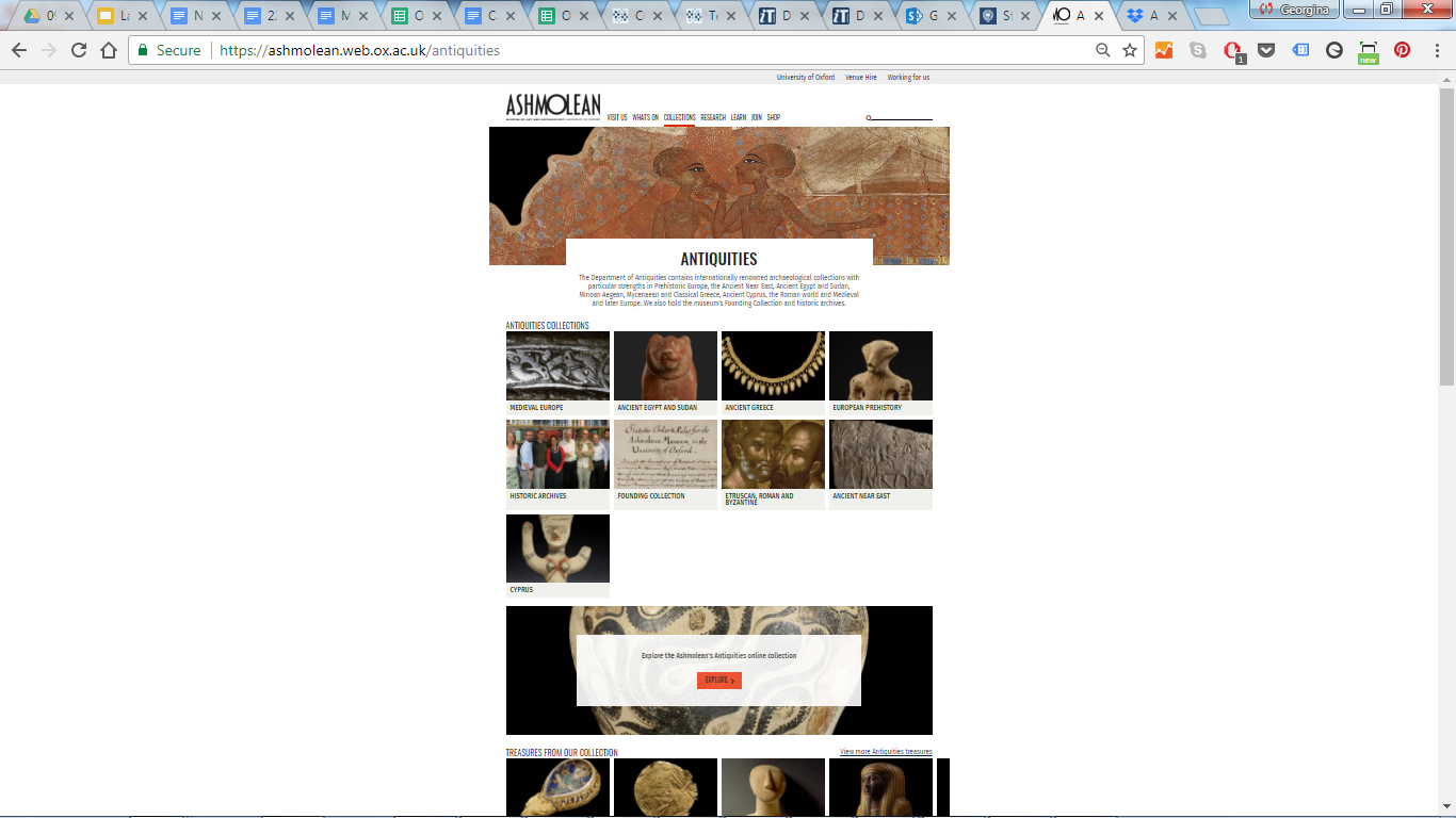
This gives a lovely 2 sentence summary of what the antiquities department is, and then a visual listing of the collections it has. Each of those listings link through to a new page with further detail on that subcollection. So it meets both specialist and more exploratory visitor needs.
The next module is a full width banner. It links to the full online digital database pre-filtered for antiquities.
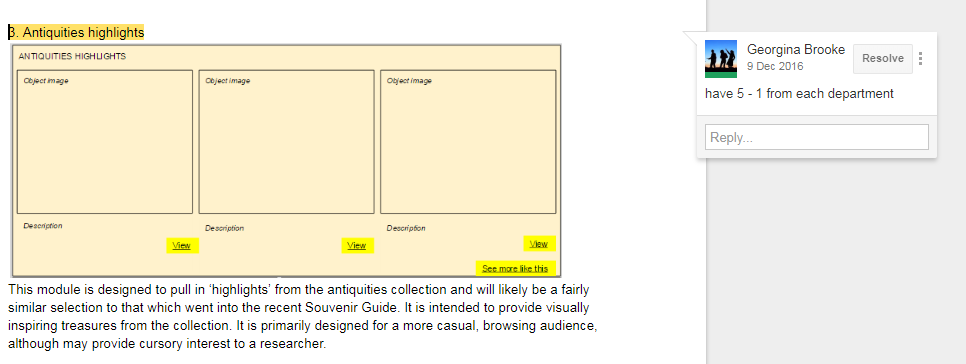
Beneath this are the highlights of the antiquities department, and a link to the full listing of Museum treasures filtered by antiquities, and so on.
What do you think? How have you found working with antiquities? Have you found any documentation particularly useful? Would be great to hear about other approaches.