Lorem ipsum is dead. Hallelujah!
This guest blog post is written by Yael Ben-David. She is a UX writer who specialises in designing content for complex products.
Lorem ipsum sucks. And to my delight, it’s becoming a thing of the past.
According to Wikipedia:
“In publishing and graphic design, lorem ipsum is a placeholder text commonly used to demonstrate the visual form of a document without relying on meaningful content. Replacing the actual content with placeholder text allows designers to design the form of the content before the content itself has been produced… It’s nonsensical, improper Latin.”
But here’s the thing: visual designers should not be forming content before the content has been produced. If placeholder text was once (an unfortunate) convention, it is more suitable for waterfall environments. We’re (thankfully) in an era where agile is taking over, and for good reason. Placeholder text relegates content to an afterthought, literally, instead of it’s rightful place as a powerful element of UI design that is also cheap (in a good/lean UX way) and ubiquitous.
Content designers have been anti lorem ipsum since before it was a thing. Finally, the world is catching up. It’s becoming common knowledge that using placeholder text is inefficient, ineffective, and leads to easily preventable suboptimal UX.
Here are just a couple of the most egregious problems that surface when lorem ipsum is part of the process:
1. Translations break the design
Visual designers can’t anticipate whether the design will break in other languages (for example, German) if they don’t know what content they’re designing the space for.
Likewise, content designers can’t keep in mind how their copy might break the design if they don’t know the space they’re working with. Only by collaborating (negotiating?) from wireframing/low-resolution design stages can visual + content designers forge synergetic harmony.
2. You’ll miss touch points where the UX breaks down
In Lorem ipsum is a Crime, Jesse Day wrote:
“Placeholder copy is a crutch that lets you put off solving the real problem in hopes that a writer will fix it for you later.”
But as I mentioned in my presentation on UX writing to the Design and Product departments at the company where I work, microcopy — as powerful as it is, which is very powerful — cannot fix bad UX all on its own.
For example, when using real copy, you may “…realize that one step in your flow should be broken into two, or maybe two steps can be combined into one. But you only have that realization when you finally think about the words.” Thanks, dude. Couldn’t have said it better myself. (This has actually happened to me.)
Nick Babich agrees: “Work on text early because text problems often reveal design problems.”
Good UI/UX designers create beautiful flows. But UI/UX design is about more than art — it’s about communicating with the user in the most delightful way to get his or her job done.
The designer might intend for one screen to lead to the next, but more often than not, UI design is not intuitive/self-explanatory enough to guide the user through without words.
Specifically, when a designer adds a button but doesn’t write out the CTA, they are assuming the user will understand where to go next, but that is not a safe assumption at all. If only the content designer was brought in at that stage, he or she would have provided the words that may in turn highlight holes in the conversation between user and interface, awkward pauses that turn users off. An obviously clickable button together with a written CTA is the recipe for clarity in the UX you’re serving your users.
I propose the following solutions:
1. Early collaboration
Visual designers and content designers should be working together from day one, which I’m pleased to say, seems to be a trend that’s catching on. Building hierarchies and considering progressive disclosure together is an important part of that.
"When the content is properly laid out, it improves readability and user comprehension. Gone are the days when wireframing was just about showing gray boxes with Lorem Ipsum flashing right in front. Nowadays, it’s about connecting through actual content so that the layout itself is enough to capture the entire design intent."
— TECHVED in UXmag
Also, UI/UX designers are cool. Hang out with them.
2. The right tools
An important point where collaboration breaks down, is when visual and content designers don’t use the same tools. That’s dumb. Our tools should work for us; we shouldn’t work for our tools. (Hello user-centered design.)
In my experience, designers tend to feel at home in Photoshop and Sketch. Anastasiia Marushevska even wrote “…unless you can use Sketch, you can’t work along with designers.” That might be a bit dramatic. I do have Sketch, but only because it’s what my designers use. I’m not sure I would have gone there if they didn’t start it.
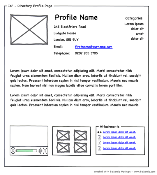
Content people in my company usually go for Balsamiq. Designers might turn their nose up at Balsamiq but it’s certainly good enough for wireframes. And that’s when we should start working together. A process that starts with Balsamiq is a process that forces early collaboration, and that’s a good thing.
KopieApp seems like a super cool tool built exactly to fill this collaborative-tool-void, but it’s in beta and I haven’t been invited to test it out, so I can’t say more.
When all else fails, there’s always protocopy. Vomit something on the page. Use that in place of lorem ipsum. Write proper copy, but always start with meaningful content, no matter what.